Cultural Color Systems

Chinese Traditional Colors
Chinese traditional colors revolve around the "five colors" of blue, red, yellow, white and black, interwoven with the culture of the Five Elements and the five directions. Their poetic names carry rich symbolism and were used across every aspect of traditional life.

Japanese Traditional Colors
Japanese traditional colors are mostly drawn from nature — cherry blossoms, maple leaves, moss and the sea. Their soft, elegant tones and poetic names embody the aesthetics of mono no aware, and they appear in kimonos, ukiyo-e prints and gardens, reflecting a refined sensitivity to nature and detail.
Natural Color Systems
Plant Colors
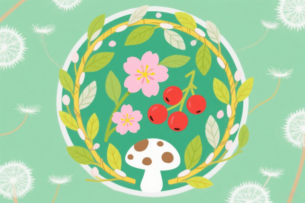
Inspired by the natural forms of plants, plant colors range from leaf green, pollen yellow and fruit orange to moss teal and vine brown. Fresh and soft or vivid and bright, they bring a natural vitality to fashion, home décor and design, conveying a comfortable sense of closeness to nature.
Mineral Colors
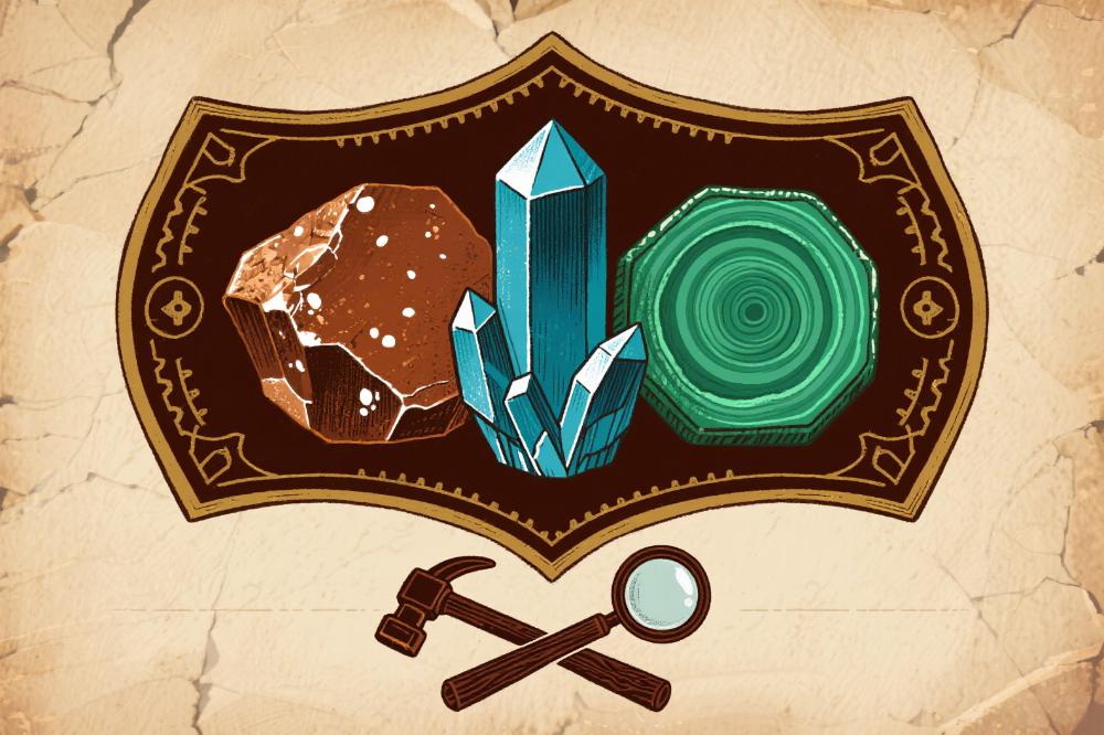
Extracted from natural minerals, mineral colors include azurite blue, malachite green, ochre, cinnabar and realgar. Deeply saturated or calm and warm, they carry a primitive, time-honored quality and are widely used in traditional painting, ceramics and jewelry design — a classic system uniting natural minerals with human craftsmanship.

Astronomical Colors
Inspired by the sun, moon, stars and other celestial phenomena, astronomical colors include clear-sky blue, sunset red and night-sky black. Bright or profound, they are often used in design to convey the romance and grandeur of the heavens.
Distinctive Art Color Systems
Rembrandt Colors
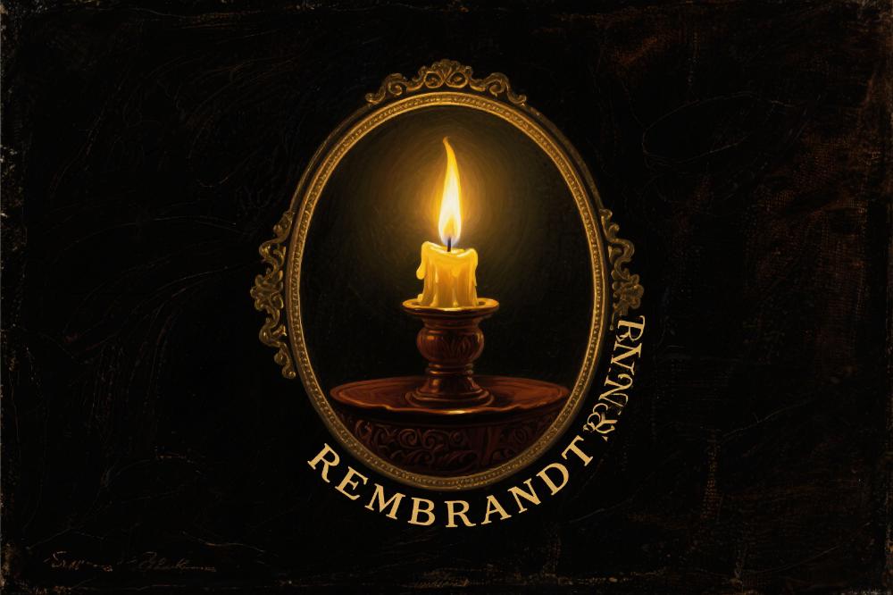
Named after the painter Rembrandt, this palette is dominated by somber tones such as deep brown, ochre and dark gold. Its masterful use of chiaroscuro gives it a heavy, vintage atmosphere, often used in painting and retro design to highlight elegant texture.
Baroque Art Colors
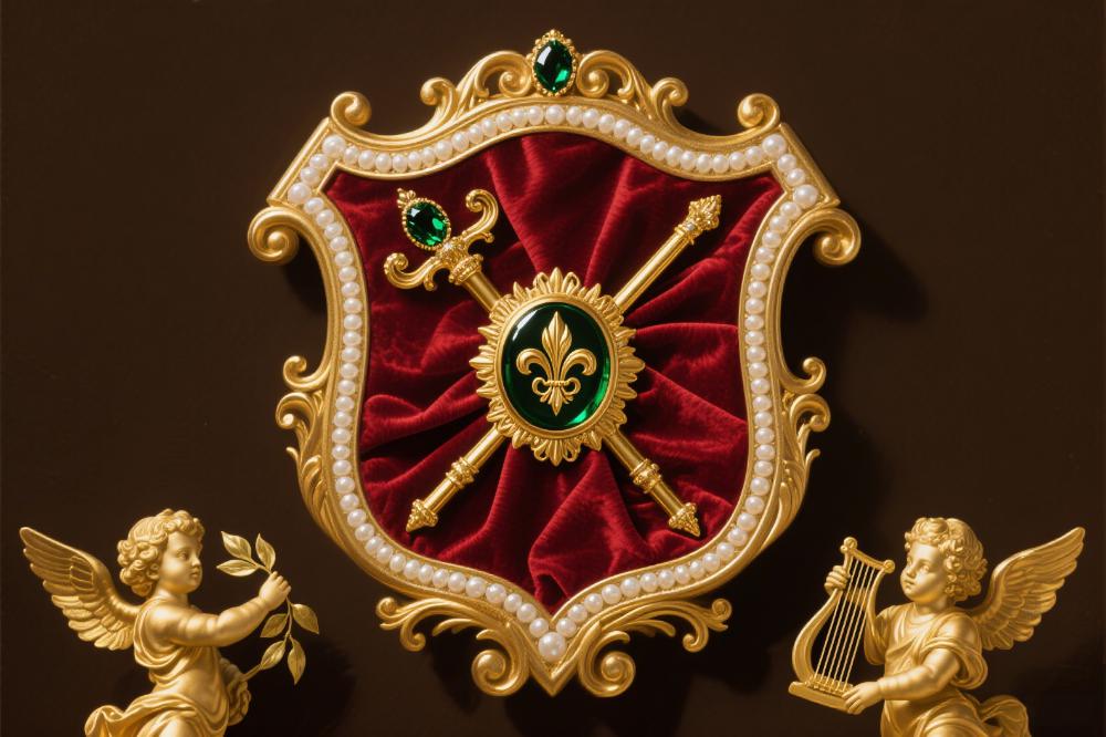
Baroque art colors are rich and saturated, including gold, red and sapphire. Opulent, passionate and dynamic, they are often used in art and decoration to convey a sense of luxury and tension.
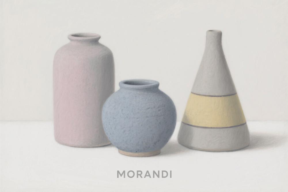
Morandi Colors
Morandi colors are dominated by low-saturation tones such as gray-pink, soft blue and pale yellow. Gentle and refined, they create a serene, quiet texture and are widely used in design.
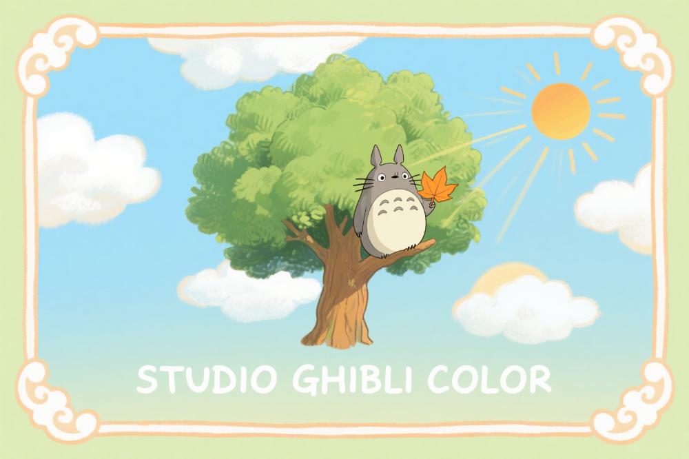
Hayao Miyazaki Colors
Hayao Miyazaki colors are largely drawn from natural imagery — clear-sky blue, grass green and warm yellow. Bright yet soft and soothing, they are often used in animation and design to convey a fresh, lively atmosphere.
Color Theory Systems
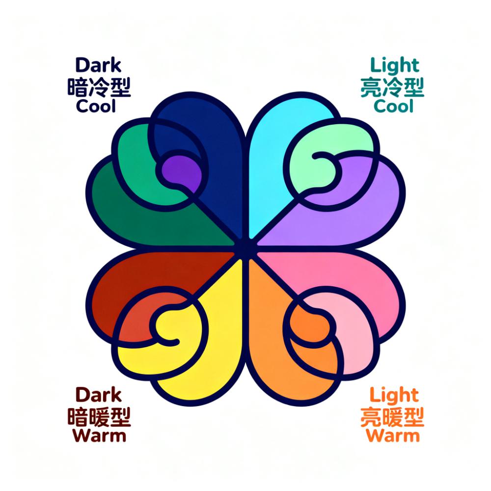
Itten Subjective Colors
In his book The Art of Color, Johannes Itten classified people's subjective preferences into four types — dark cool, light cool, dark warm and light warm — each corresponding to a distinct color gamut.
Color Card Matching | Color Cards | Color Collection
This page is the classic color card overview of Color Explorer. It brings together 10 classic color cards in distinct styles, grouped into four categories: traditional culture color systems, natural environment color systems, distinctive artistic color systems, and color theory color systems. Every color card is a curated, verified palette chart, so you can use its color combinations directly for color card matching or apply a single color code to your own design projects.
What Are Color Card Matching and a Palette Chart
A color card is a set of colors organized around a theme; a palette chart is a set of colors within it that have a clear pairing relationship and can be used directly; and color card matching is the process of deciding the dominant, secondary, and accent colors based on a particular color card. Compared with choosing colors by feel, matching colors with a color card offers three advantages: tonal consistency (colors within the same card have similar lightness and saturation, so they combine more harmoniously), solid grounding (traditional colors come from the five-color system, and Itten’s colors come from color theory), and higher efficiency. This page can therefore also serve as an entry point to the color collection: whether you want to find a specific color code or set the tone for a project, you can start from the color cards below.
The 10 Color Cards on This Page and Their Features
1. Traditional Culture Color Systems: Chinese Traditional Colors and Japanese Traditional Colors
Chinese traditional colors are centered on the “five colors” of blue, red, yellow, white, and black and blend the concepts of the Five Elements and the five directions. Their names — such as vermilion, moon white, indigo, and pale gold — are all poetic. Overall they are warm, rich, and highly symbolic, making them ideal for Chinese-style, festive, and culturally substantial brand palettes. Japanese traditional colors are mostly drawn from natural scenes such as cherry blossoms, maple leaves, moss, and the sea; they are elegant, soft, and comparatively grayed-down, embodying the aesthetics of mono no aware. Both belong to the Eastern system: Chinese traditional colors are fuller and more formal, while Japanese traditional colors are more understated and everyday.
2. Natural Environment Color Systems: Plant Colors, Mineral Colors, and Astronomical Colors
Plant colors are inspired by the forms of plants and cover leaf green, pollen yellow, fruit orange, moss teal, and vine brown. Fresh or bright and full of life, they are often used in fashion and home design. Mineral colors are extracted from natural minerals such as azurite blue, malachite green, ochre, cinnabar, and realgar. Deep, composed, and time-honored, they are classic choices in traditional painting and ceramic design. Astronomical colors are inspired by the sun, moon, and stars, ranging from clear-sky blue and sunset red to night-sky black. Strongly atmospheric, they suit romantic and grand imagery. All three share the feature that their colors have a real source, which makes them highly immersive.
3. Distinctive Artistic Color Systems: Rembrandt Colors, Baroque Art Colors, Morandi Colors, and Hayao Miyazaki Colors
Rembrandt colors are dominated by deep brown, ochre, and dark gold and make skillful use of chiaroscuro; they are weighty and vintage. Baroque art colors center on intense gold, red, and sapphire; they are opulent, passionate, and dynamic. Morandi colors are dominated by low-saturation tones such as gray-pink, soft blue, and pale yellow; they are gentle, refined, serene, and sophisticated and are among the most frequently used palette charts in contemporary UI and home design. Hayao Miyazaki colors mostly use clear-sky blue, grass green, and warm yellow; they are bright yet soft and soothing. Together these four cards span the full emotional range from somber to opulent and from restrained to bright.
4. Color Theory Systems: Itten Subjective Colors
Itten subjective colors originate from the subjective color theory in Itten’s The Art of Color: people are divided by subjective preference into dark cool, light cool, dark warm, and light warm types, each corresponding to a color gamut. Its value lies in offering a “person-specific” color-matching methodology, ideal for building a personal color style or tailoring an exclusive palette for a client.
How to Use These Color Cards and Palette Charts
Click any color card to open its detail page, where all the colors included in that system are listed as cards. Each color card is labeled with standard HEX and RGB color codes, and clicking a color swatch takes you to the color detail page to view HSL, HSV, and CMYK parameter conversions, complementary and analogous schemes, WCAG contrast, and shade variants. Suggestions: first pick a color card by theme to set the tone, then choose 2–3 colors from it as primary and secondary colors, and finally return to the color collection to add neutral colors as a buffer. If you have no direction yet, you can also browse the four categories first and work backward from the visual feeling to the mood and style your project needs.
How Color Card Matching, Palette Charts, and the Color Collection Relate
Put simply: the color collection is the “library,” the palette chart is the “combination,” and color card matching is the “method.” The color collection organizes more than a thousand color codes across 11 color families and answers “what value is this color”; the 10 classic color cards on this page answer “which group of colors fits this theme”; and the color scheme section offers more finely divided palette charts by season, mood, color temperature, and style. Together they cover the complete flow from finding colors and grouping them to using them.